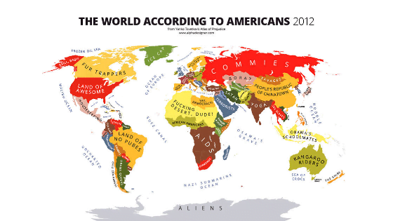
If you’ve never lived outside your own country, it’s easy to form assumptions—often inaccurate ones—about other cultures. Stereotypes are universal; everyone holds some, but they can sometimes be wildly exaggerated or hilariously off-base. To capture this in a humorous way, London-based designer Yanko Tsvetkov created a series of infographic maps that visualize global stereotypes through a satirical lens. Some of the most amusing examples highlight how Americans see the world, turning cultural clichés into witty, thought-provoking illustrations. We’ve gathered the most relevant maps below—take a look, have a laugh, and let us know which one made you think twice. (Click on the maps to enlarge.)
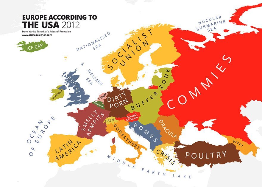
2. Europe
3. Asia

Infographic maps that poke fun at how Americans see the world have become a humorous yet revealing way to highlight cultural stereotypes and geographical biases. These satirical maps often exaggerate how some Americans might reduce entire regions to clichés—Europe becomes a mix of “France (Paris)” and “Danger Zone,” Africa is labeled “Safari Land,” and everything beyond the U.S. is vaguely grouped as “Not America.” While playful and intentionally over-the-top, these maps spark interesting conversations about global awareness, media influence, and how cultural narratives shape perception. They’re not just jokes—they’re reflections of how limited exposure can skew our worldview.
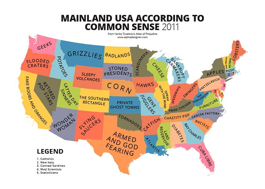
4. North America

5. South America

6. Africa

7. Central America

8. Oceania

9. USA
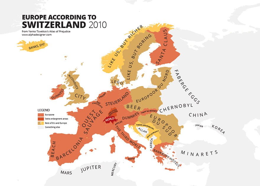
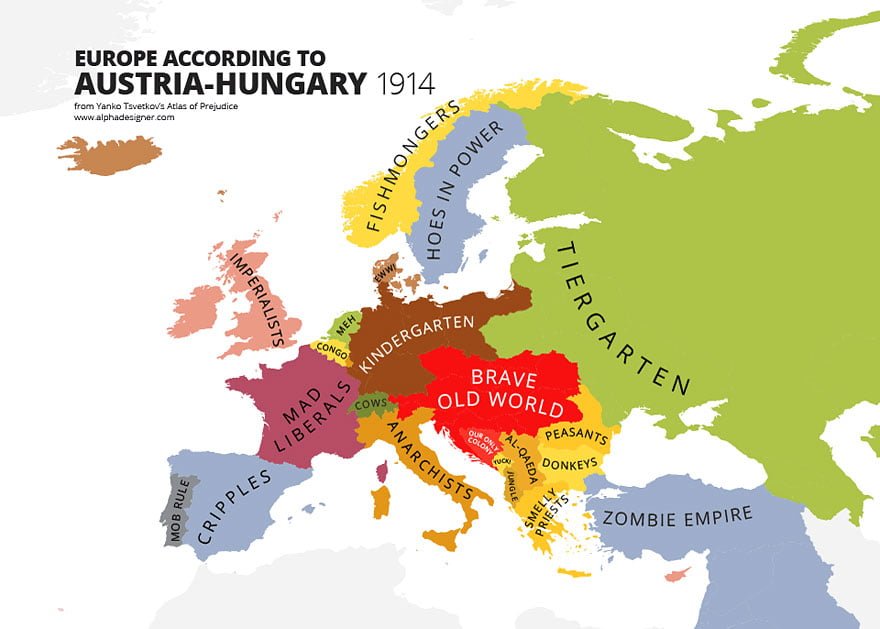
10. Europe According to Austria

Of course, it’s important to remember that how Americans see the world isn’t a one-size-fits-all situation. While these maps are meant to be funny, they play on exaggerated stereotypes that don’t reflect the reality for many Americans who are well-traveled, globally aware, and genuinely curious about other cultures. The internet, education, and increased global connectivity have made it easier than ever for people in the U.S. to engage with the wider world in meaningful ways. So while the maps might get a laugh, they don’t define everyone—just a playful snapshot of how cultural perceptions can sometimes get hilariously warped.
11. Europe According to GB

12. Europe According to Balgaria

13.

14.

15.

16.

17.

18.

19.

20.
21.

22.

23.

24.

25.
26.

27.

28.

Source: alphadesigner.com