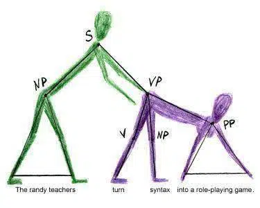
Knowledge of language is at the heart of every craft and profession. It is especially important in graphic design. Sometimes, a designer who is well-versed in languages and words will always bring out design ideas that are a wonder to look at. However, more often than not, we encounter really embarrassing design fails that must have required an edit to save them from being a spotlight of shame and ridicule.
We brought you 35 design ideas that went really bad. Some of them are the result of a lack of language-related knowledge and others are just downright mishaps. Browse through them and let us know what you think.
1. Being gay was a sin, they said.

2.

3. How could they!!

4.

5. I bet this was intentional.

6. Trick or treat.

7. Be a problem solver.

8. This teams shorts.

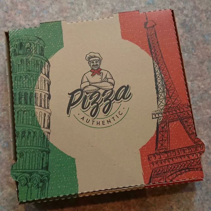
9. Ah Yes, The Eiffel Tower, My Favorite Italian Landmark.

10. Circles have already won.

11. Shit Yourself.

12.

13.
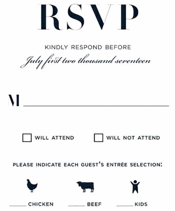
14.

15.

16. I Cancelled My Transaction Twice In A Row By Accident. I Finally Found Out Why

17.
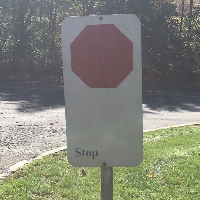
18.

19. Proofreading This Book Couldn’t Have Been That Hard.

20. A-maze-ing indeed!

21.

22. Warning- made in China.

23.
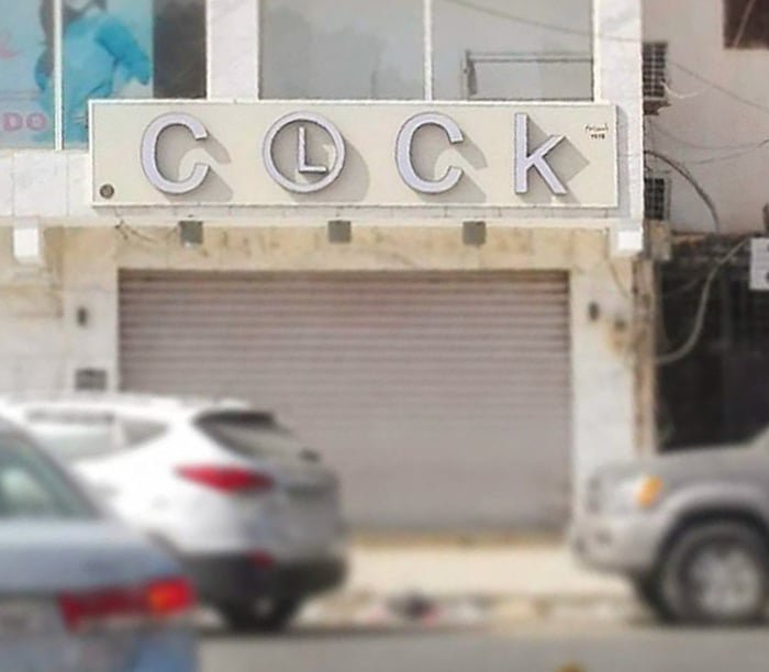
24.

25.

26.

27. Who’s the author again?

28. The Name Of The Hotel Is Henri 4.

29.

30. Thta could never be fine.

31.
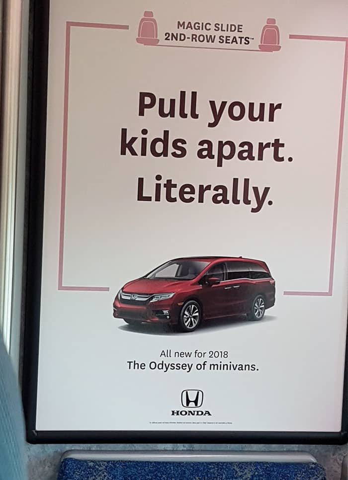
32.

33. ?!!

34.

35.


